
The First Letters
A typeface born from the joyful imperfections of children learning to write
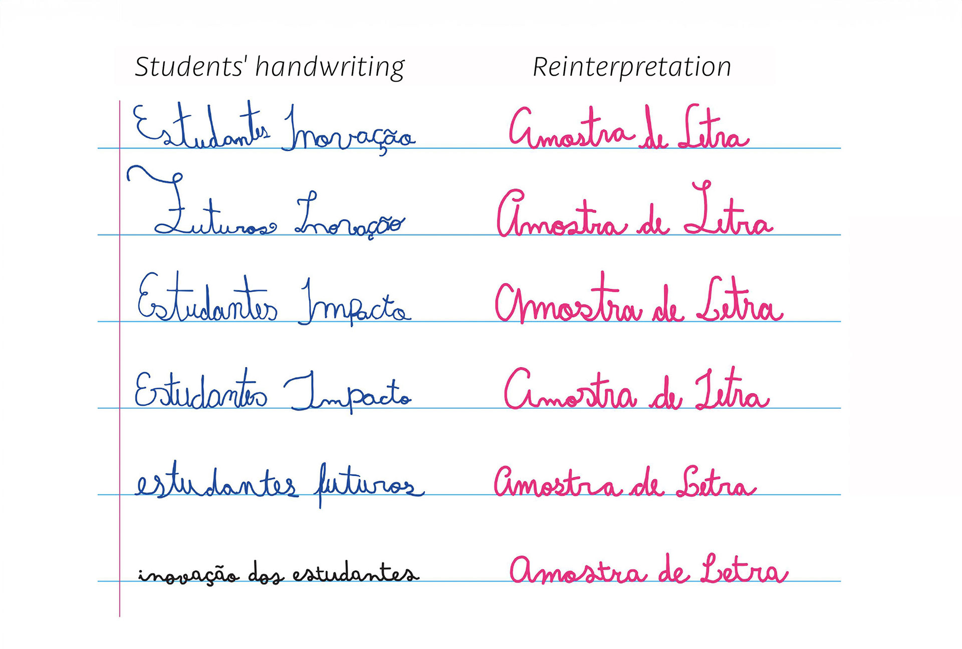
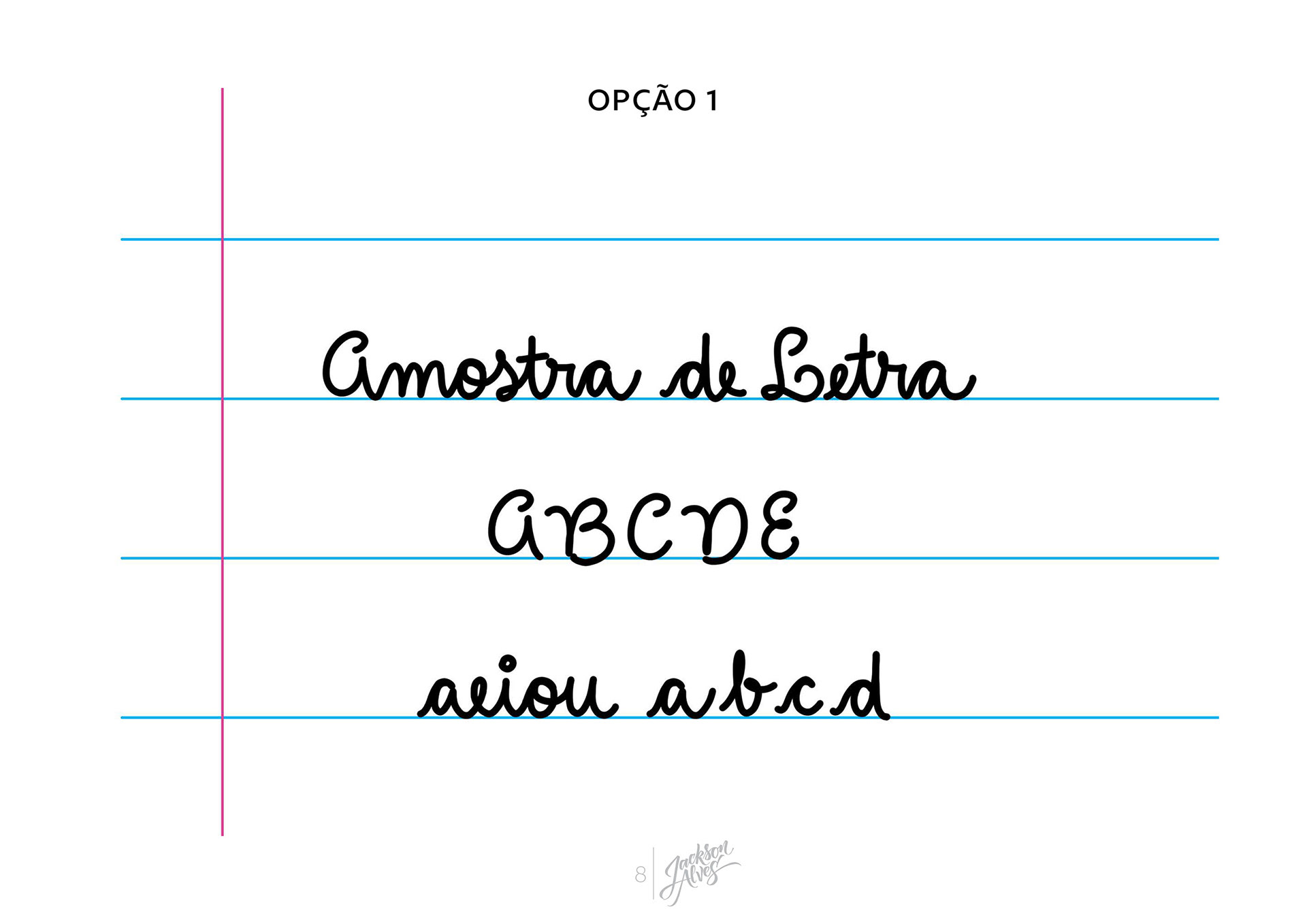
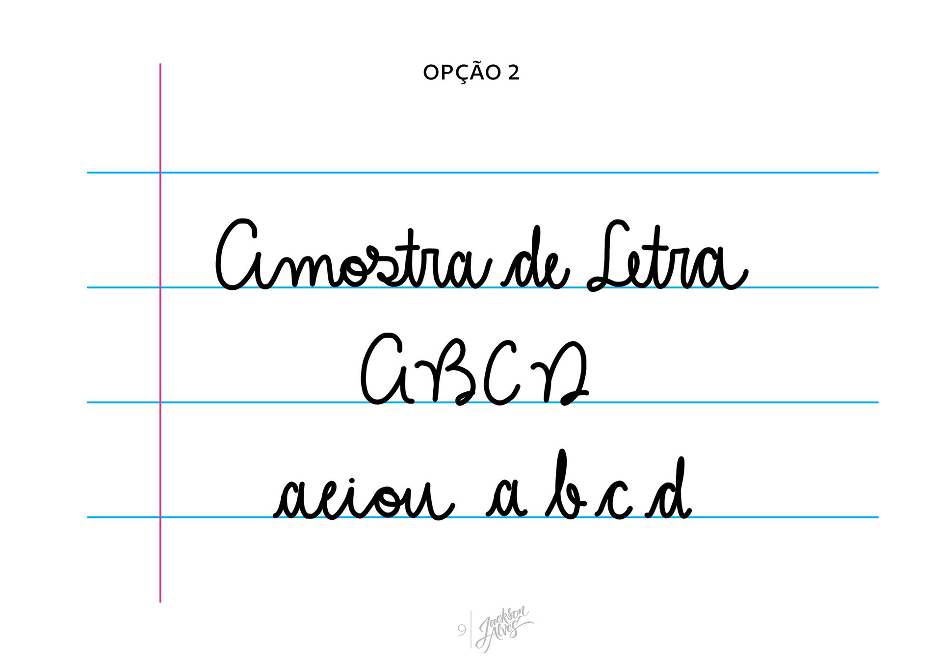
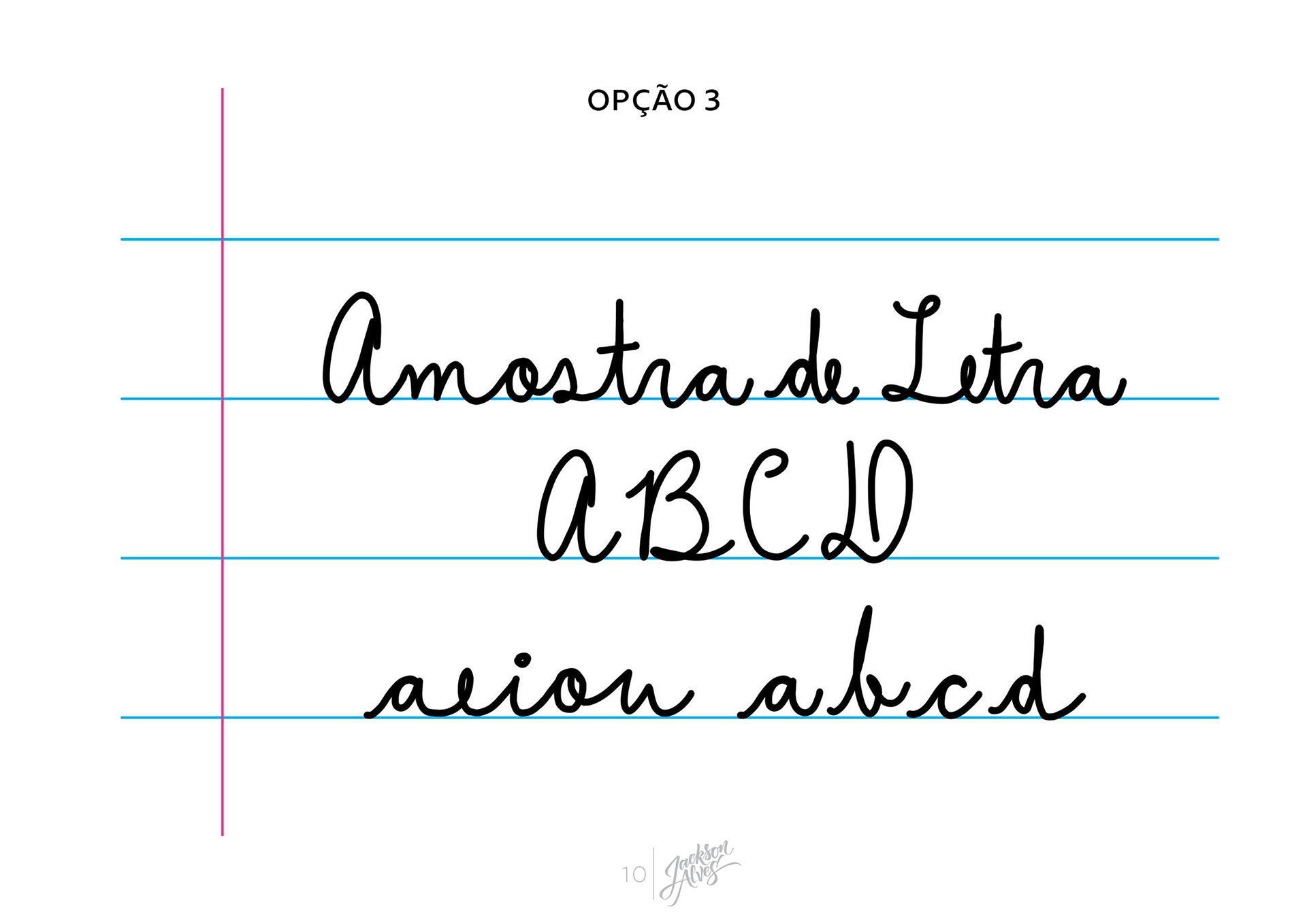
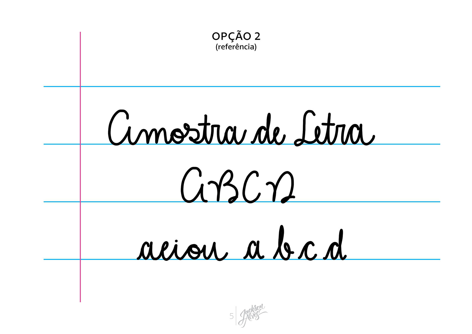
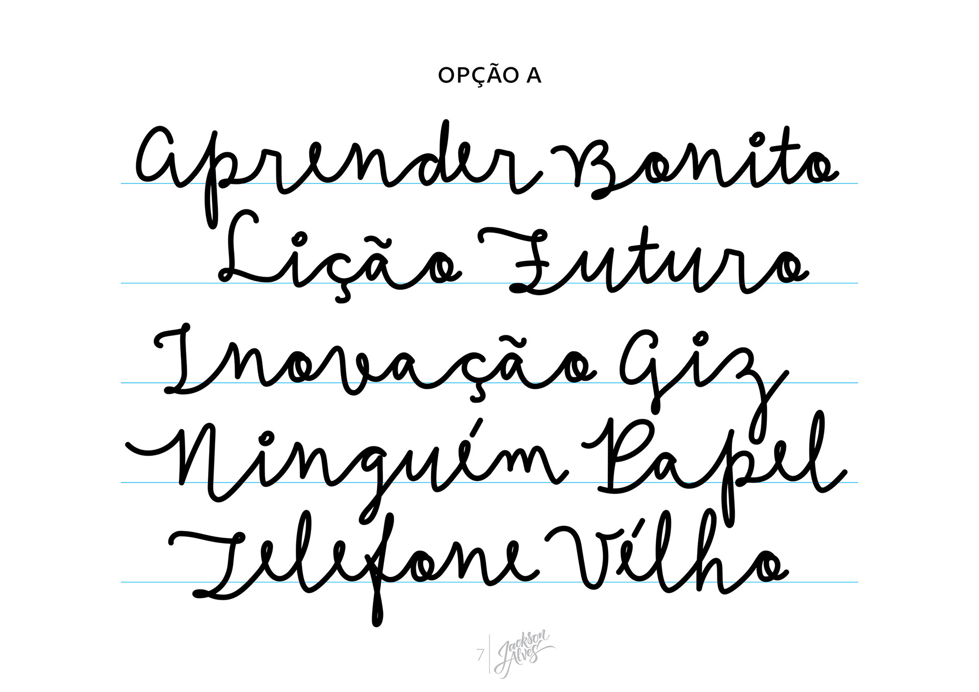
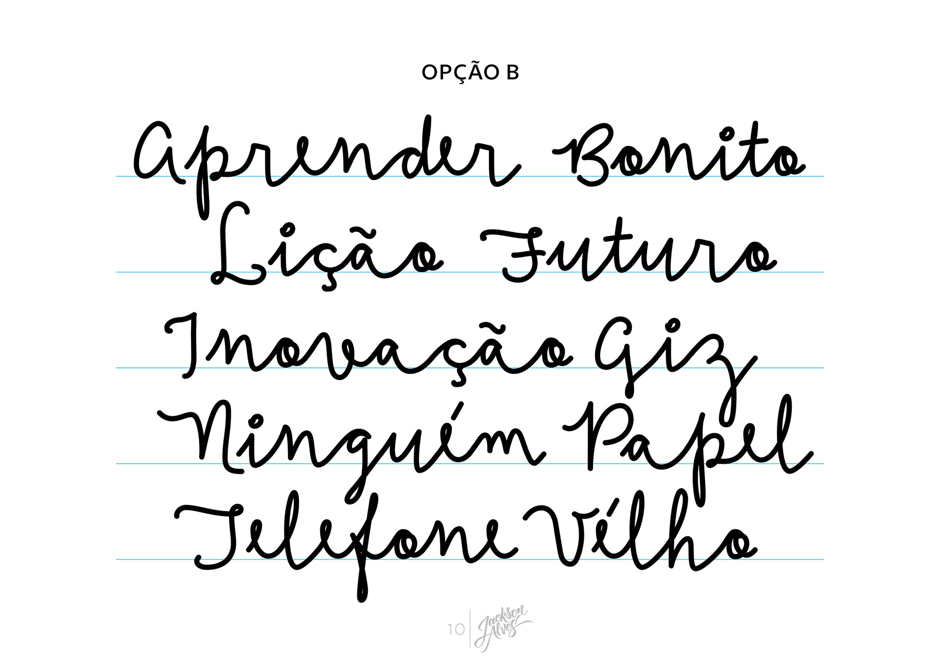
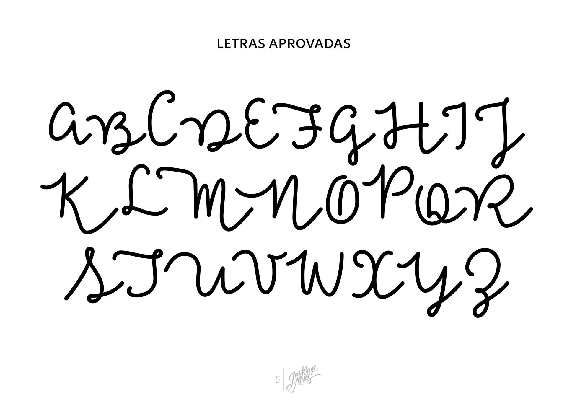
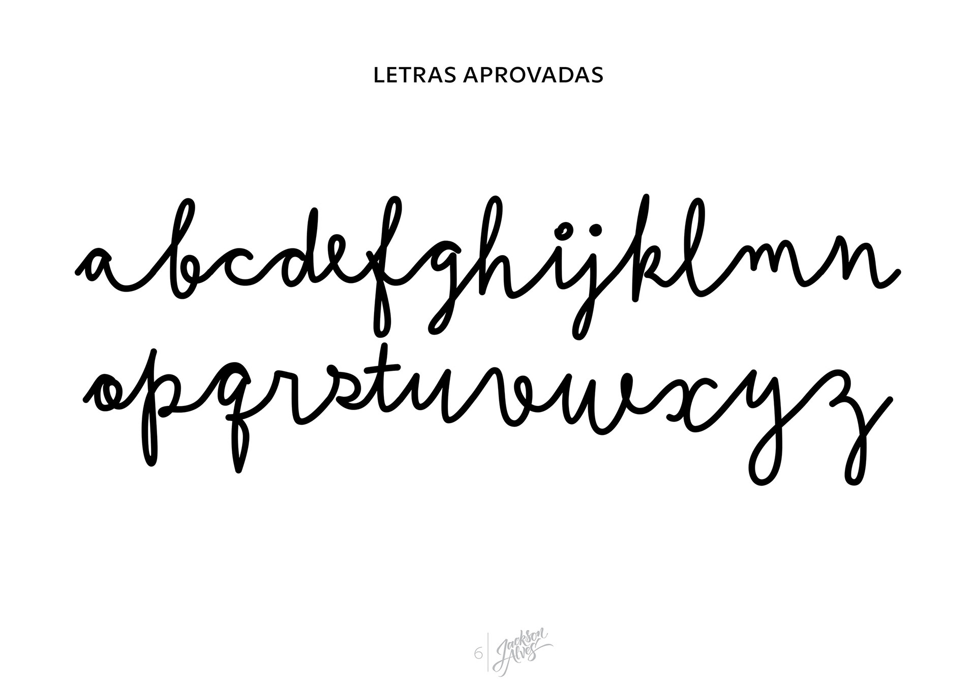
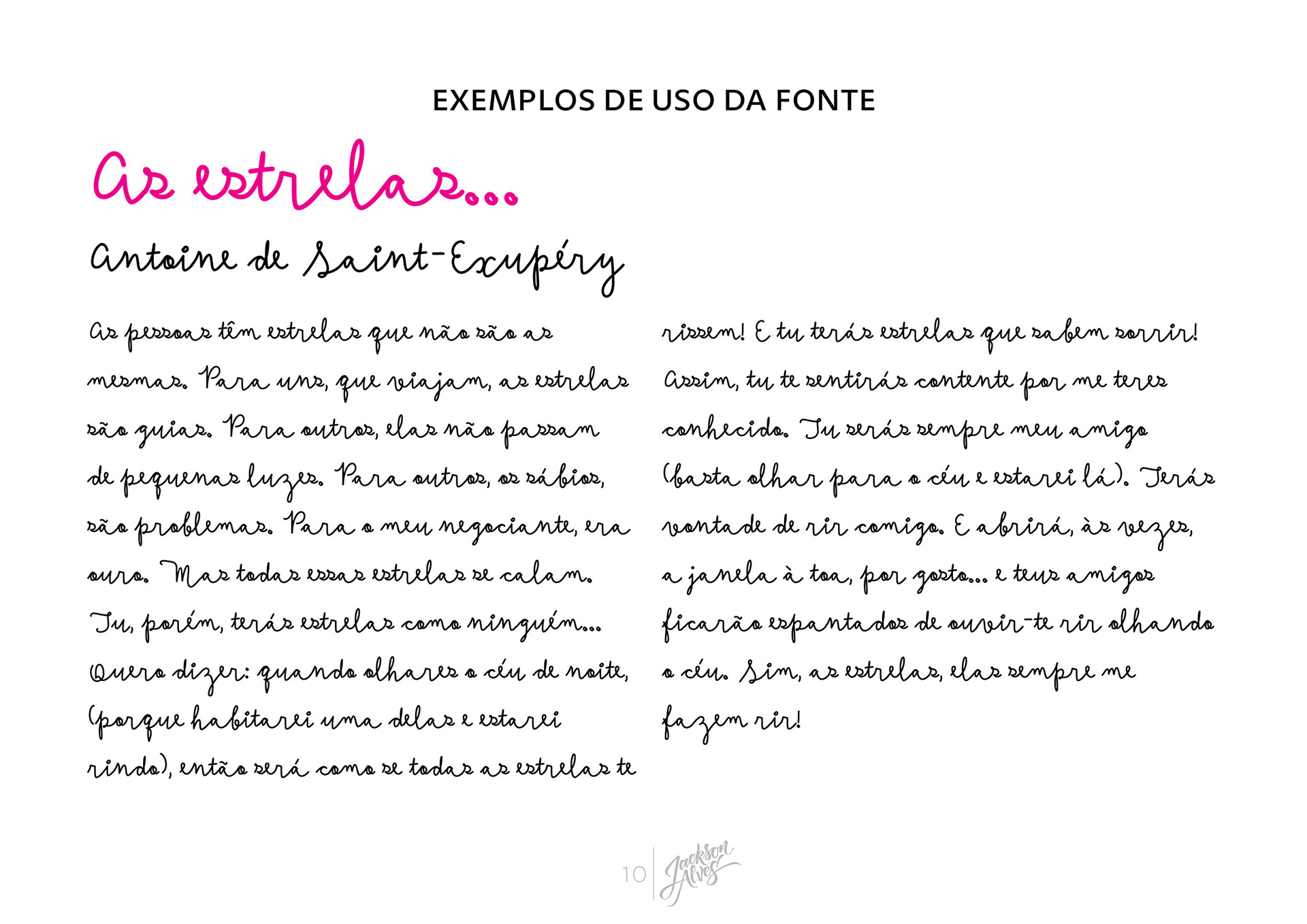
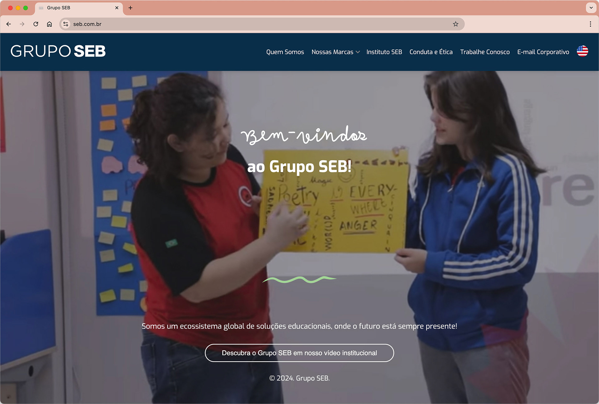
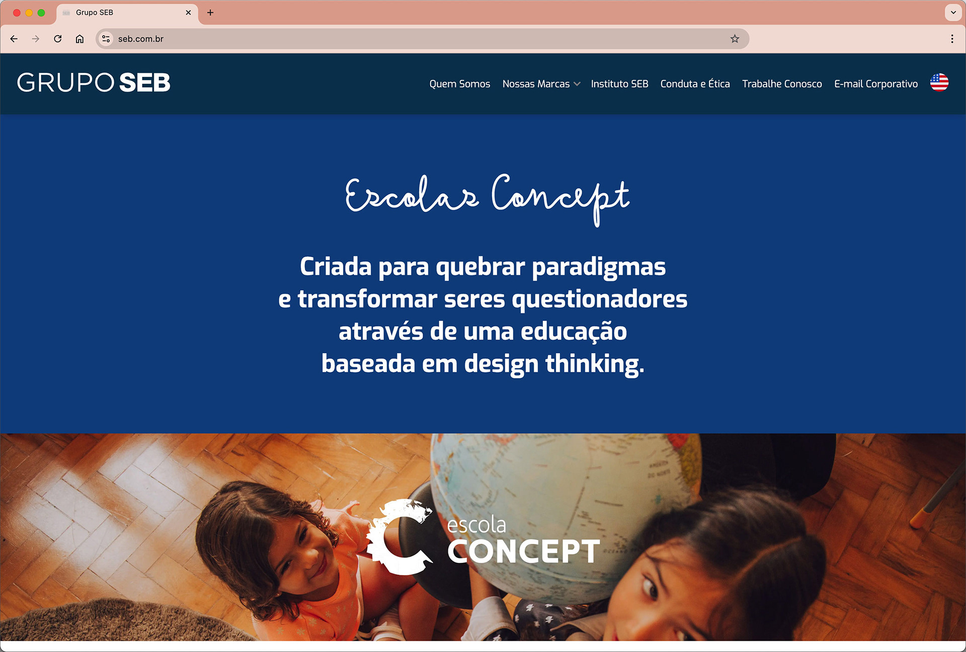
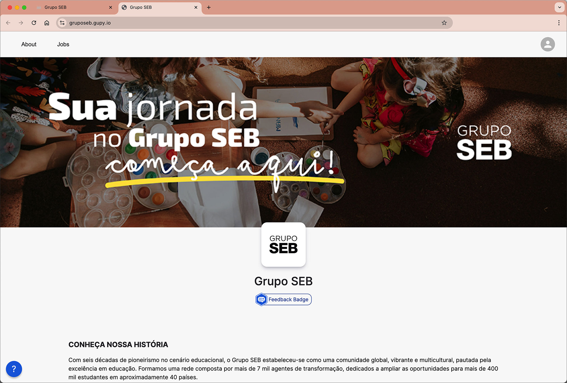
I was commissioned by Grupo SEB to create a custom typeface that emulates the handwriting of a child learning to write. They were already using a similar font in their visual identity, but wanted a proprietary solution to avoid licensing issues and ensure consistency across all communication materials. Based on samples of students’ handwriting from their network of schools, I developed a cursive typeface that captures the charm and spontaneity of early writing. The result is a playful yet functional font that is now used across the group’s visual identity, including their website and printed materials.